Softly, Softly: Colours of the Year for 2016

Pantone and paint brands go pale for 2016
Each fall, Pantone – long considered the world’s ‘colour authority’, if there is one – releases its ‘colour of the year’. After several years of focusing on vibrant, rich tones, they’ve gone in a totally different direction this year, naming ‘Serenity’ (pastel blue) and ‘Rose Quartz’ (a pale pink) as the co-colours of the year for 2016.
More significantly – at least from our perspective, since I’m pretty sure we won’t be asked to paint too many rooms in a pink and blue combination – is that the trend towards muted, natural colours seems to be fairly consistent across paint manufacturers as well. Dulux says their colour trends for 2016 are a ‘muddy palette inspired by nature’; Benjamin Moore has named ‘Simply White‘ its colour for 2016; and Sherwin Williams is calling ‘Alabaster’ its colour of the year for 2016.
(‘Alabaster’, for most of us, is also known as ‘off-white’.)
What does this mean for your home in 2016?
First of all, it’s important to remember that colour trends are only a guideline, and there are lots – lots! – of different opinions out there. Just last fall, experts were pegging turquoise and metallics as the hot new colours for your home; the Colour Marketing Group has chosen 4 vibrant, darker colours for 2016; House Beautiful seems to be favouring lilacs and lavenders; and of course some experts just choose a wide palette to cover all the bases.
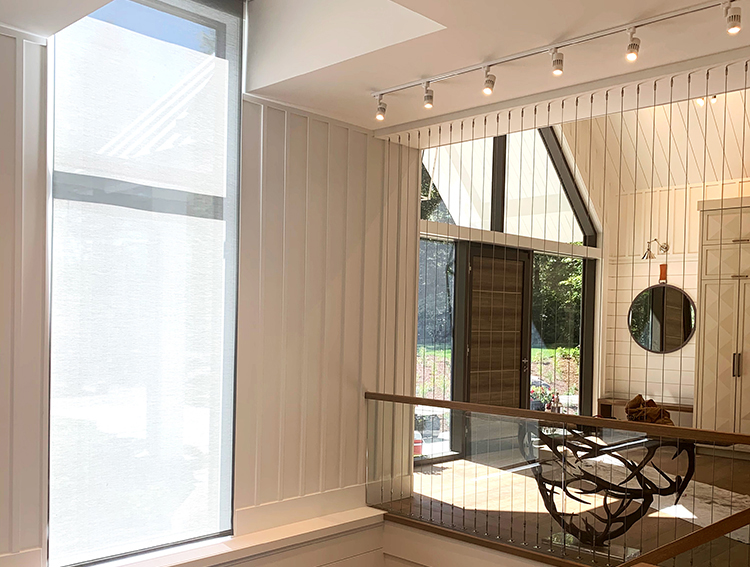
Our advice is always to avoid getting too attached to one single colour trend or season. Instead, step back and try to make sense of the overall picture. What we’re seeing overall is a move away from super-saturated, super-vibrant colours toward a more muted palette. This isn’t really surprising given that the last couple of years have seen a shift away from warm taupes and dark browns to cooler grays and whites as a base colour palette for homes.
These overall trends don’t come and go with every season, so you don’t have to worry that today’s paint colour will be out of fashion as soon as 2017’s colour trends are released next fall. We expect to see this muted, gray-based colour palette continue to be popular for the next couple of years at least.
Of course, there are exceptions to every rule: If you think your powder room would look spectacular if all four walls were bright turquoise and the ceiling was a metallic pewter, you might just be right!
