Paint Colour Trends 2019
If you’re looking for inspiration for your next paint project, consider one or more of these top 2019 paint colours to set the right mood for those areas of your home that you would like to refresh.
From calm grays to warm terra cottas to dark greens and rich blues, there’s a trending colour for every taste—whether you’re conservative or daring.
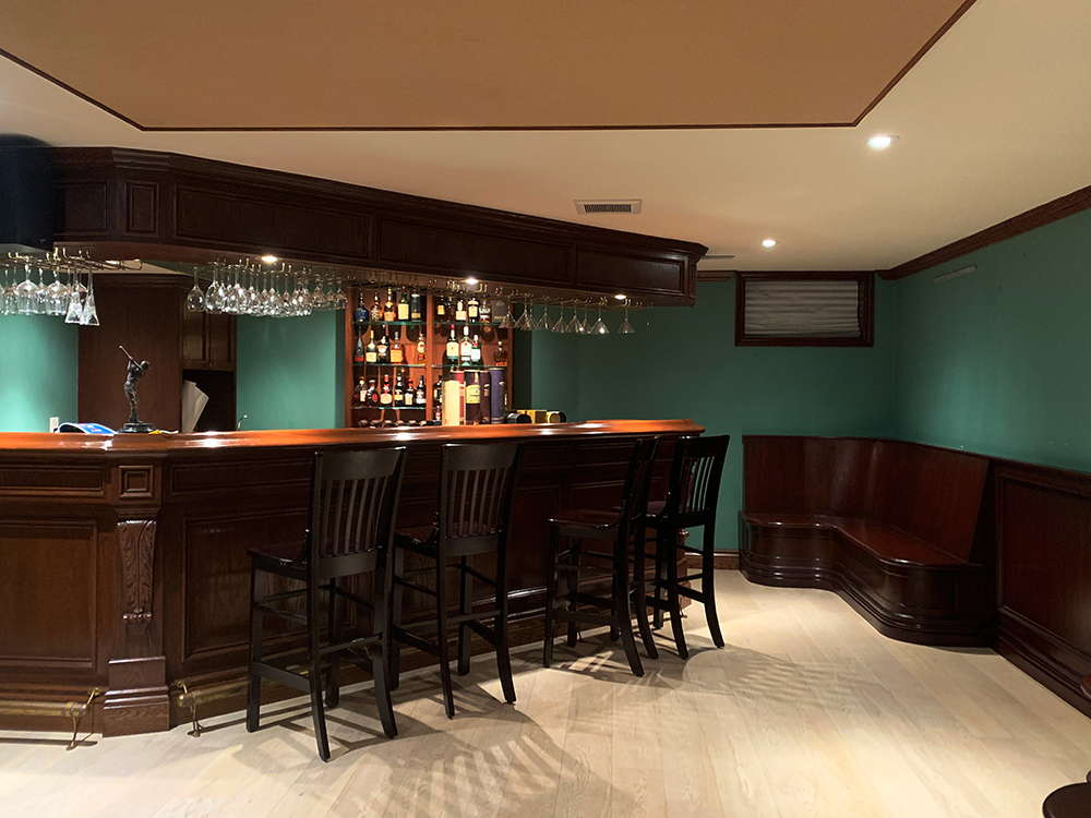
Deep greens
Resembles the deep green hues found in forests.
Reflects our craving for a connection with nature and its restorative power.
Works beautifully with natural elements and neutral tones.
Use in well-lit, large rooms as its intensity can overpower small spaces and make them look darker.
Earthy tones
From a soft stylish gray with cool undertones to various shades of blue to a terra-cotta reminiscent of Georgia red clay, these soft and calming natural hues provide an almost blank canvas that’s anything but bland.
Soft gray: Adds a soothing touch to a sleek kitchen; for a look that’s dreamy and sophisticated, try a soft gray in a bedroom. Works well with warmer colors to balance its coolness. Lilac gray’s undertones are warmer and a tad moodier.
Hazelnut: It’s warm and inviting creamy shades never go out of style or clash with existing furnishings; makes it a comforting go-to hue. Varying shades of hazelnut are great for bouncing light off to make a room appear larger than it is.
Mist: A blend of muted pastel blue and green with a gray and lilac undertone; a blank canvas for decor of all colors and styles; a much more interesting starting point than standard beiges and whites.
Mushroom: An earthy color–gray blended with warm brown–gives off an old world, naturalist feel.
Pewter: The perfect gray-beige and a rich alternative to all white walls; can taking pewter paint color ideas throughout your home rather than just one room, as its one shade works well with everything, everywhere.
Warm terra-cotta:
Brings the outdoors in—think canyons and deserts. Represents the growing
popularity of the desert-modern style. Soft clay paint colors are great
alternatives to beiges and browns as they lend any room a certain sunny zest
and casual elegance. Terra cotta, caramel, clove, and burnt orange home
interior colors have more personality than any neutral ever could.
New Blues
Blues speak to balance, but with a bit of flair that embraces optimism.
Blues can be soft and calming when combined with natural hues, but energizing and fun when used with vivid and bold colours.
For the traditionalist with a casual approach to interior design, charcoal blue, ice blue, gray-blue, and a very pale powder blue are great options when looking for paint colours that are far from every day, yet subtle enough to not take over a room.
Stainless steel blue is a fresh colour, similar to periwinkle, that can brighten a space. It can be paired with neutral oranges or charcoals that bring a sense of creativity to a room.
Bold Colours
Zesty orange: Consider it for your home office or an extra bedroom. Play with contrasting hues, such as a minty green, pale yellow, and neutral gray for an interesting whole-room palette.
Living Coral: a bright, life-affirming shade of orange coral, with golden undertones. Use it in your kitchen, a dining area, or a room to relax in. This hue pairs well with bright tiles, warm stone, and greenery.
Mustard: For those looking for a pop of color and an alternative to gold, deep mustard is great for instantly creating rich focal accents and make for smart paint colors for accent walls and even trim. Creates provocative depth and highlight décor and art brilliantly.
Muted Pastels
Pastels in chalky, muted tones, have a soothing appeal that brings with them an understated vibe. They’re perfect for gender neutral rooms and common areas like kitchens and bathrooms
They make for a warm backdrop for minimalist design.
Go for similar muted pastel paint colors if you’re looking for the unexpected without having to commit to a bold color trend.
What are the best choices for you?
We can help you decide.
While some colours may lend themselves better to large bright rooms, others would be perfect for smaller areas, kitchen cabinets or shelves.
Eric, our savvy painting consultant, can meet with you to talk about what works best with your lifestyle and design preferences.
To book a complimentary in-home consultation, give us a call at 416-674-7265