Paint and Colour Trends for Fall 2014
As we head into the last quarter of 2014, here’s a roundup of the current design, paint and colour trends for this fall:
Turquoise: Pantone may have announced ‘Radiant Orchid’ as 2014’s Colour of the Year, but the colour most often turning up in cutting-edge designer rooms right now is turquoise. Want to have a little fun with turquoise without having to renovate the whole house? We recommend using it in a powder room, on a front door, or even on the ceiling of a den or spare bedroom.
Dark reds: Pantone – the colour trend experts – say that dark reds are one of the key colours for fall. However, these aren’t the maroon shades so popular in early-1990s living rooms. The 2014 colours are brighter, more sophisticated, and recommended for accents rather than entire main floors (though a dark red dining room, paired with delicate furniture, could be a dramatic showpiece).
Dark purples + metallics: Style at Home calls this the ‘plum and pewter’ combination. Think deep purple – or a super-dark lavender – which is balanced by silver or gold metallic colours. Go high-drama with lots of dark purples, dark grays and metallic gold accents, or keep it more subtle by balancing touches of purple with silver and white.
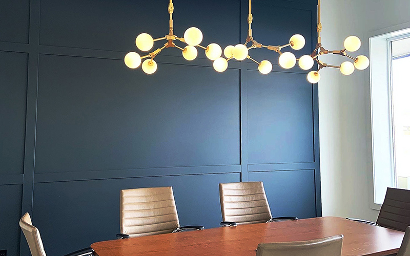
Dramatic kitchens: While some of us will always prefer a bright-white kitchen, designers are going in a more glamourous direction. Think deep, jewel-toned cabinets, custom-painted metallic backsplashes, and chandelier-type light fixtures that used to be reserved for the dining room.
Ceilings: Once treated like the ‘forgotten’ surface – painted builders’ white and then ignored – ceilings are getting more attention, particularly in urban homes where rooms are smaller. Reflective, colourful ceilings can add a lot of interest to a room without significant architectural features, or draw attention upwards to highlight unusual lighting fixtures.